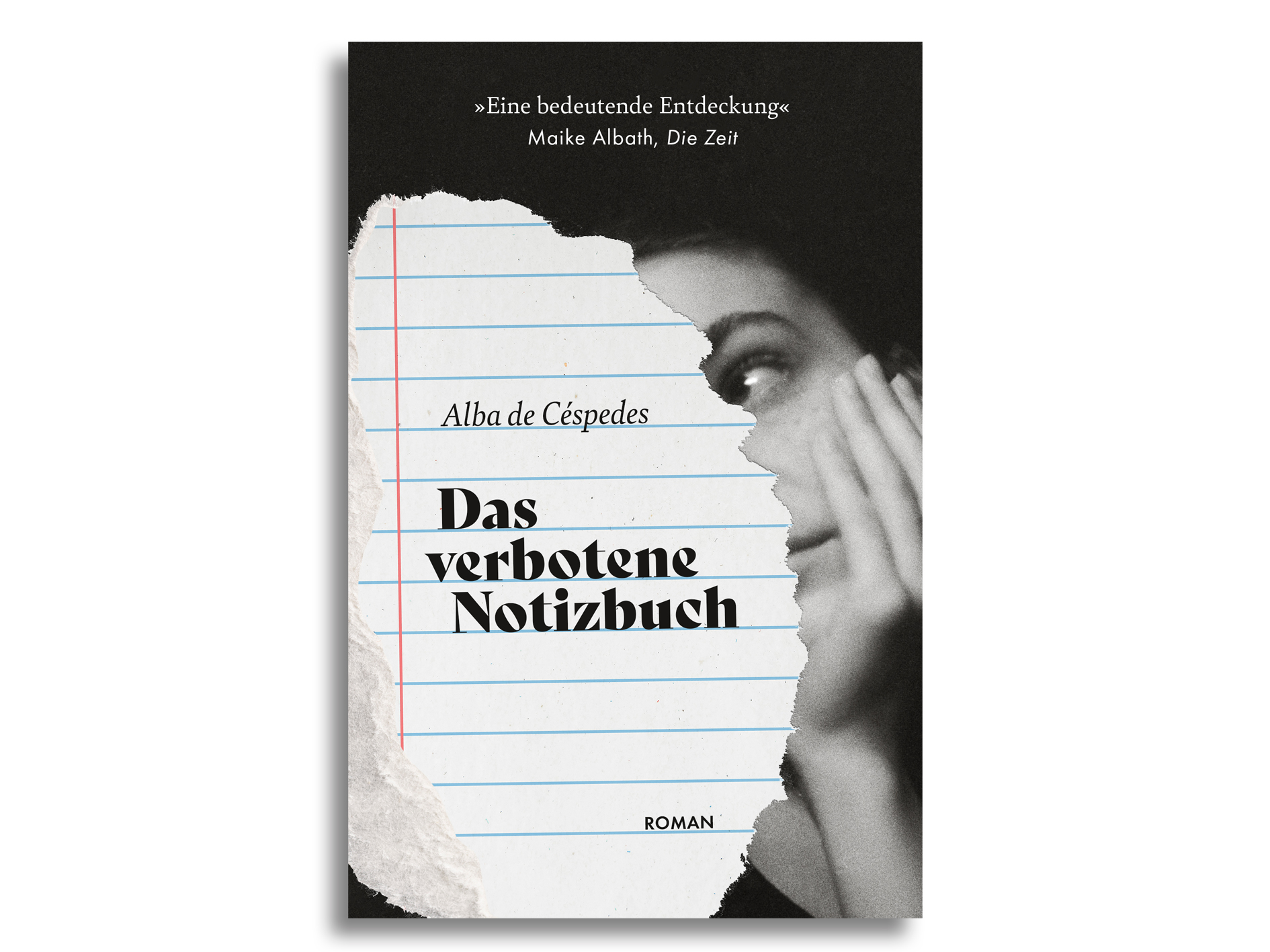
Project Re.Cover #2 – Forbidden Notebook by Alba de Céspedes
This took forever! Here it is, my second redesigned book cover.
The Book
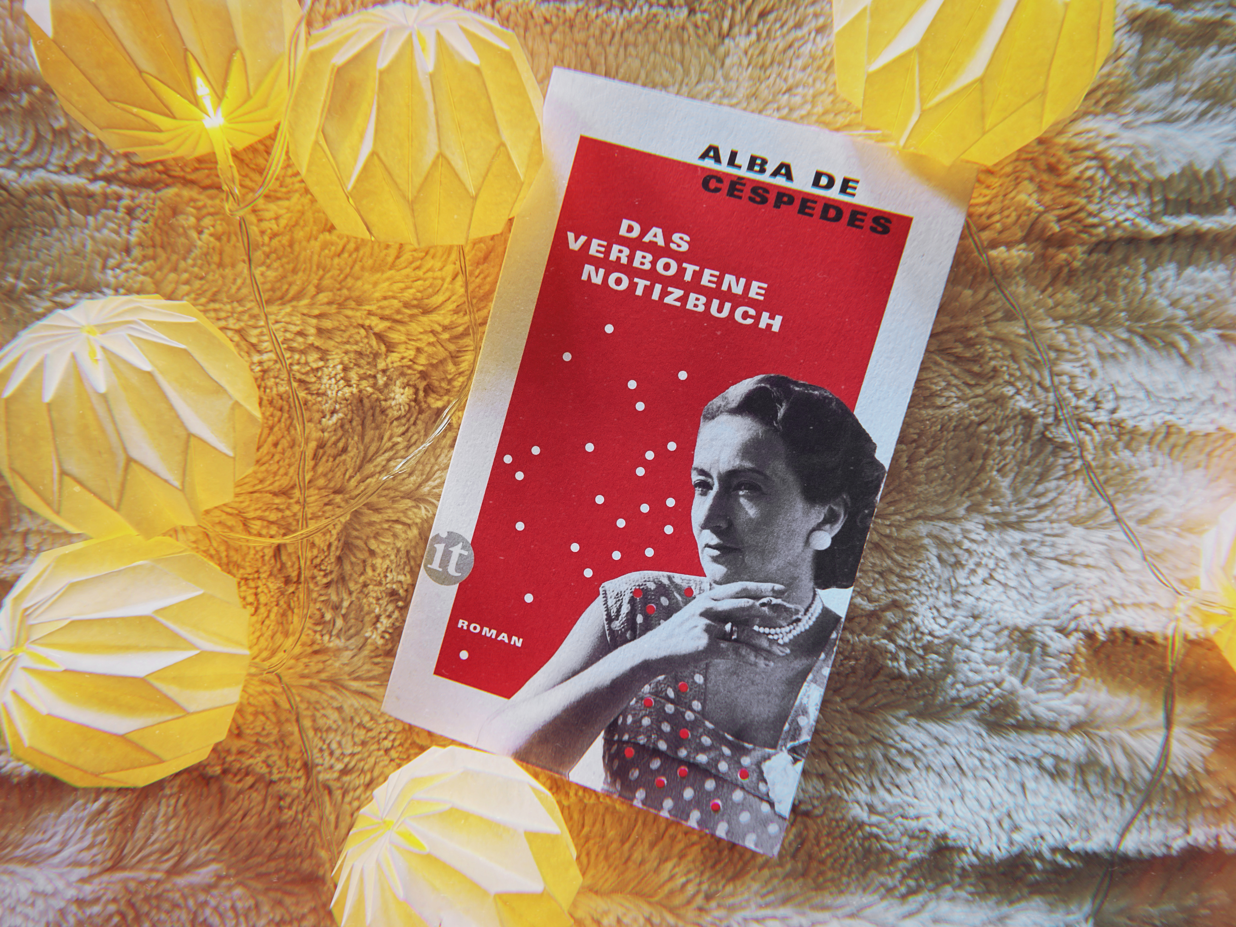
Das verbotene Notizbuch by Alba de Céspedes. I read the German version from Insel Verlag; an English translation is available from Pushkin Press next year.
One Sunday afternoon in November, only a few years after the war, Valeria Cossati, out on an errand for cigarettes, buys a black notebook. She begins writing in it at night, during stolen hours away from her family’s eyes, changing the book’s hiding spot every few days. She writes about her family life, the daily routines and her growing concern about her daughter, her son and her estranged husband. Having given the last twenty years of her life to her family, Valeria begins to wonder where this life leaves her, as a woman and a person in 1950s Rome.
The paperback edition of this book caught my eye with its bright red colour during a book shopping trip back in October. I’m an absolute sucker for fictional diaries and epistolary novels, so I had to pick it up, and what a good choice that was. Somehow this Italian housewife’s diary manages to be a page turner, a quietly accelerating story of womanhood, gender roles and generational conflict that made me both want to speed up and slow down at the same time, to make it last longer. I loved this book, one of the few 5-star reads I had this year.
Inspiration
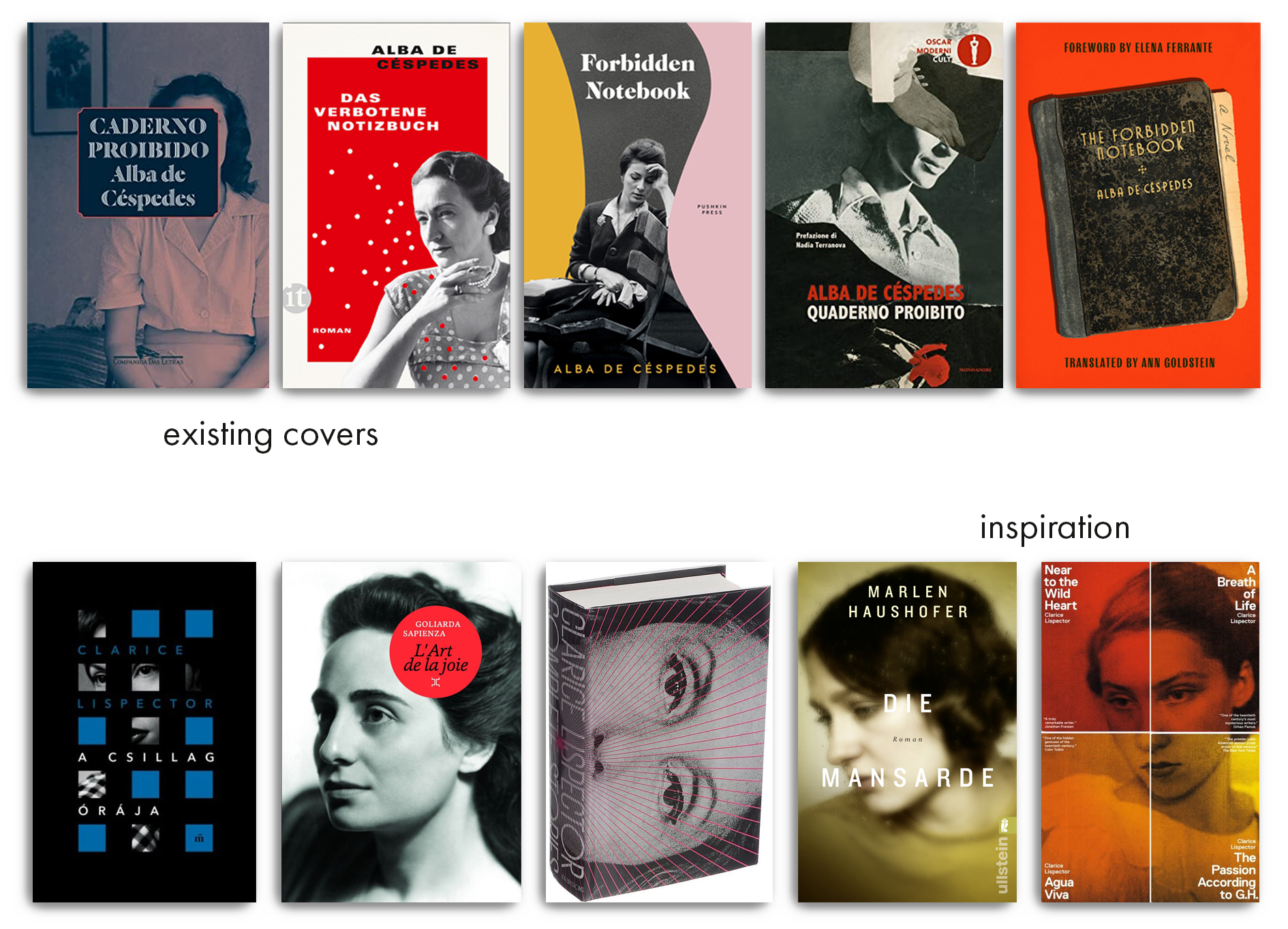
It is a truth universally acknowledged that a 1940-1960s novel about women questioning established gender roles has to have a monochrome woman’s face on the cover. (And if the author looks like Clarice Lispector, it has to be the author’s face.) I looked at some of Alba de Céspedes’ contemporaries in a similar niche – Clarice Lispector, Goliarda Sapienza, Marlen Haushofer. There’s always something about obscuring the eyes, or emphasising the eyes. And more often than not, there is some bold colour involved to pull the book into the 2020s without losing the sense of it being set in the post-war years.
Process
Now who am I to challenge a well-established formula? After scouring Unsplash and Pexels for portraits of women who wouldn’t immediately be recognisable as someone who knows about Lululemon, as well as hours spent in online archives looking for any portrait of women in 1950s Italy (no luck), I had a small collection of photos to work with. So my first approach was the “monochrome woman only”.
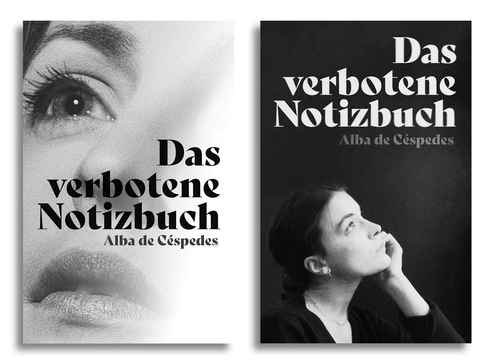
This was nice, but I wanted the notebook to play more of a role. So I added some paper, duh.
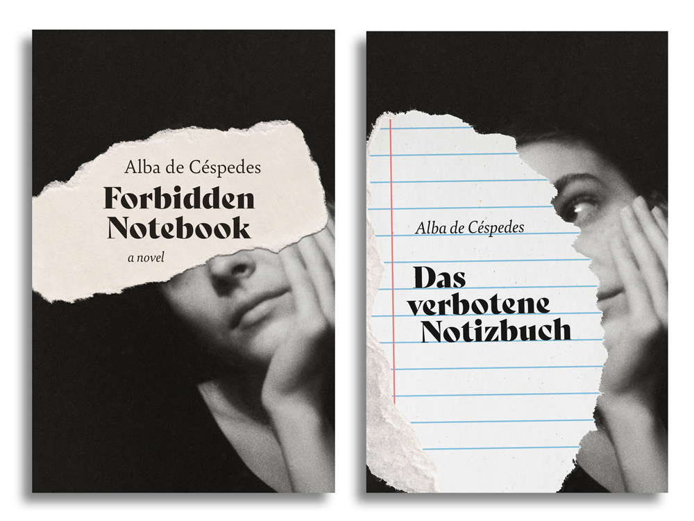
I tried the “obscured eyes” thing older editions had done before, but it didn’t feel quite right. So I let the woman keep one eye and obscured half her face with a piece of lined paper instead. This seemed promising. I added a small drop shadow to the paper for more realism and, because the whole thing was middle-heavy, a bit of text on top and bottom, and here we are.
Final result
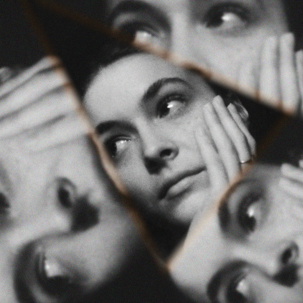
I … don’t hate this. There’s something intimate about it, which feels right for the book. I had hoped to do something more complex, maybe involving a mosaic or a kaleidoscopic effect to show ✨ the many facets ✨ of Valeria, but I couldn’t come up with a version that I liked.
Going forward, I want to spend both less and more time on these. Less time in terms of, uhm, weeks, and more focused time at one project. In an ideal world, I could produce one of these within an afternoon or two. So here’s my promise: the next one will be up before the new year!
Images used
- Photo 1
- Photo 2
- Photo 3
- Both paper textures by rawpixel.com