Project Re.Cover #1 – The Abominable by Dan Simmons

Here it is at last, the first instalment of Project Re.Cover, where I create new covers for books I’ve read.
This week: The Abominable by Dan Simmons.
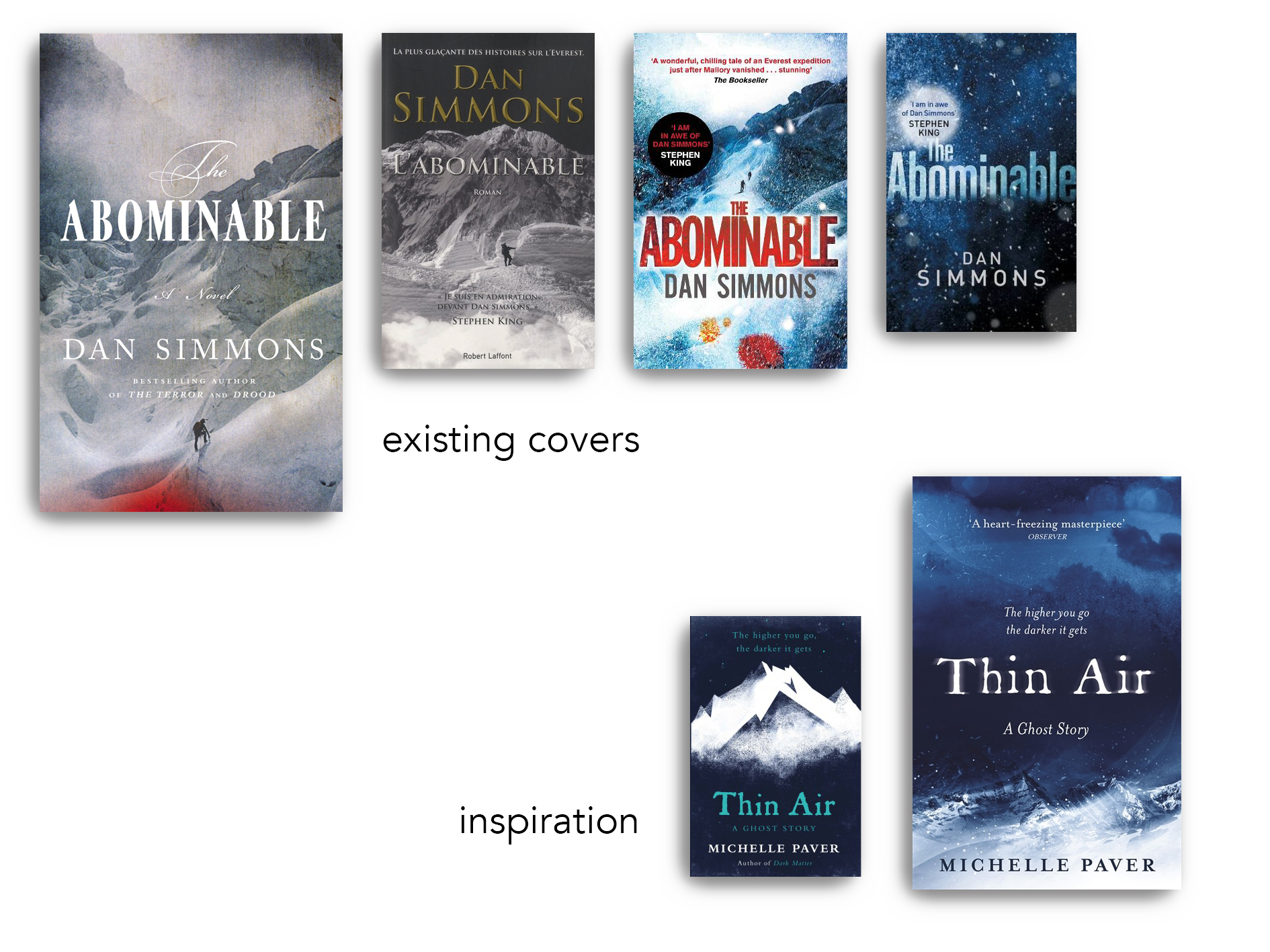
The Book
Every once in a while, once a year or so, I become a little obsessed with alpine climbing and mountaineering. There’s something about an incredibly remote, incredibly cold and forbidding environment that fascinates me, especially the Himalayas. In this mood I’ve watched pretty much any movie or documentary available on streaming services I have access to.
Some weeks ago I was craving another mountain story, and since the adaptation of The Terror is one of the best TV I’ve ever seen, I thought I’d try Dan Simmons’ The Abominable, a novel about a 1920s exploration to Mt Everest.
Because I’ve already started The Terror book twice and couldn’t get far, I got the German edition of The Abominable (inspiredly called “Der Berg” (The Mountain)), as German is easier to skim, and I think that decision alone was the reason I finished the thing. It’s … not the ‘spine-chilling’ thriller the blurb makes you expect. Feel free to head over to Goodreads for some entertainingly scathing reviews. I’ll just say that it did not deliver.
Inspiration
While the original US cover of The Abominable is almost perfect in my opinion – a painting for the focal point and swirly font that both suggest historical fiction, with a red dot that suggests sniper rifles or the approaching danger of a Dead by Daylight killer – I wanted to go darker. I wanted to make the cover of the book I would’ve liked to have read.
And what I’d wanted to read was something very much in the vein of Michelle Paver’s Thin Air, a beautifully short and, yes, spine-chilling ghost story about a 1920s expedition to Mt Kangchenjunga. Both the US and UK cover (the latter published by Orion, cover design by Laura Brett) give a sense of darkness, danger, and cold without giving any of the story away.
I’m just starting out, so: yes, I’m copying.
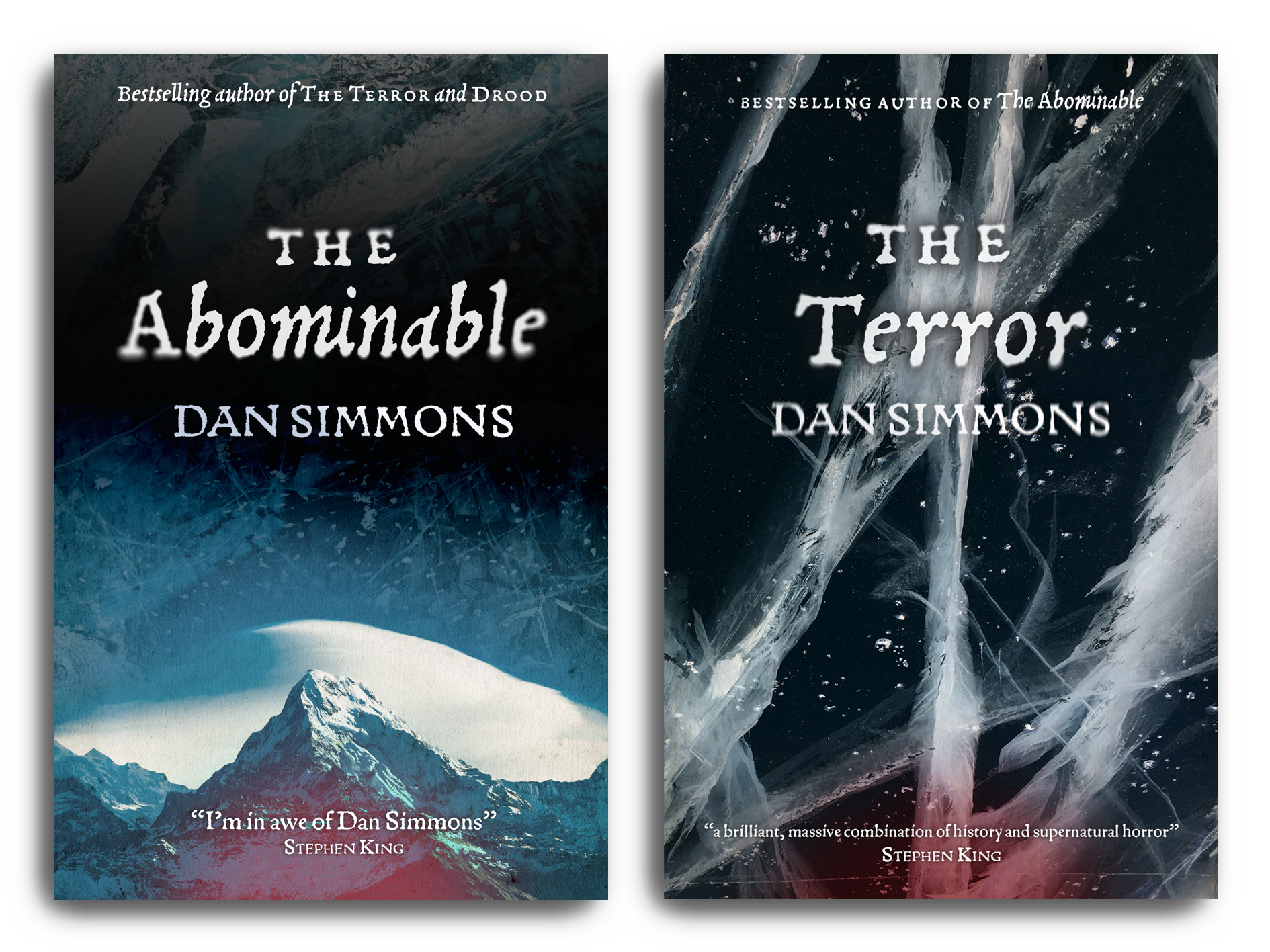
Process
There was none for this cover. When work was slow one Friday, I just opened Photoshop and started playing around. There were no sketches, no notes. My only thought was to make the cover of the book I would have liked to read, and the cover that I, were I the publisher, would commission to lure in more clueless horror fans like me. I currently have no illustration skills to speak of and no money to spend, so my go-to is Unsplash. After digging through the not very many good photos they have of Everest (there are stunning photos of many other mountain ranges, but come on, people will know), I settled on this picture from the distance featuring a domed cloud (I think) and placed it at the bottom.
Here’s the fun, because now that I’m writing it up weeks later I’m figuring out that this mountain is Annapurna, not Everest, that the Unsplash image search tricked me and that I should really read the captions more closely when I download an image. So much for ‘I gotta get this right, people will knooow’. This is why I’m not an image researcher.
deep sigh … ANYWAY – from there on things fell into place fairly quickly with a single font, some motion blur, a gorgeous photo of ice for some visual interest in the background, a paper texture for aging, and some Rule of Thirds-arranging of objects. In the end, I decided to copy the red dot from the other editions of the book, which added a nice splash of colour.

Final result
I mean. I don’t hate this at all. Is it original? Not much; looking at it now, I copied more from the Michelle Paver book than I expected I would. Would I pick it up if I saw it in store? Absolutely. In fact, I liked it so much that I made an additional cover for The Terror featuring a stunning photo I’d found of frozen ice which, rotated just so, had this gorgeously menacing and violent look that goes so well with the word “terror”. I kept the red dot for coherence so you could get them in a set, and here we are.
Images used
For The Abominable
For The Terror